
A leaflet that lands on a London doormat has exactly two seconds to justify its existence before it meets the recycling bin. You've likely felt the frustration of investing in a campaign only to see your hard-earned budget produce silence instead of sales. In a city as fast-paced as ours, generic flyers often fail because they lack the visual authority needed to capture attention. Understanding leaflet design best practices is no longer just about aesthetics; it's about survival in a competitive physical marketplace where every millimetre of paper must work for your brand.
This guide provides the technical clarity and creative strategies required to turn your marketing materials into high-conversion sales channels. We'll demystify complex print terms like bleed and CMYK whilst showing you how to maintain brand consistency across every London postcode. You'll learn how to bridge the gap between professional design and seamless distribution, ensuring your next campaign delivers the measurable response rates your business deserves. From doormat-ready layouts to GPS-tracked delivery standards, we're outlining the roadmap for your 2026 campaign success.
Key Takeaways
- Learn how the three-second rule dictates campaign success by capturing attention on competitive London doormats before the recipient reaches the recycling bin.
- Master leaflet design best practices including visual hierarchy and colour psychology to guide potential customers from the initial hook to the final action.
- Avoid expensive production errors by understanding the technical requirements of print, from CMYK colour profiles to essential bleed and quiet zones.
- Discover how to integrate QR codes and high-value offers that turn a physical flyer into a trackable digital conversion tool.
- Understand the benefits of an integrated workflow where design decisions are informed by local London postcode data and GPS-tracked delivery insights.
Why Professional Leaflet Design Support is Essential for London Campaigns
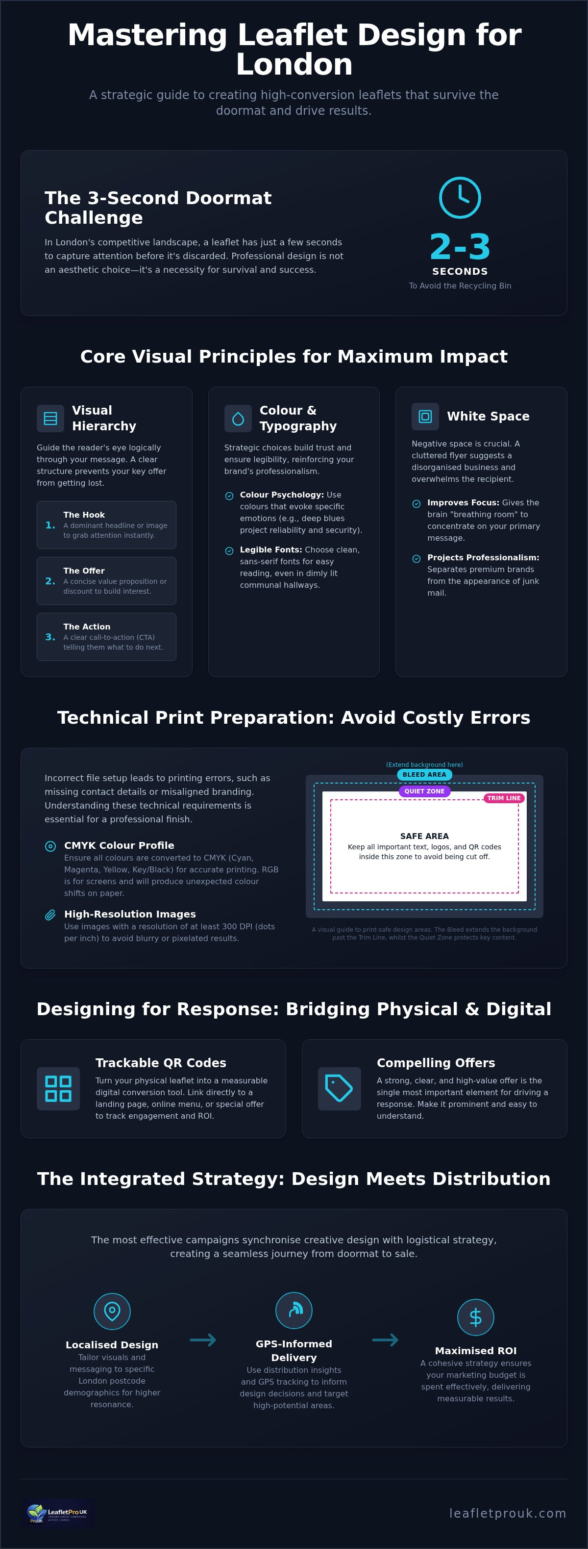
London letterboxes are battlegrounds for attention. Every day, households in boroughs like Kensington or Fulham receive a high volume of marketing material. Your headline must win the battle of the doormat instantly; you have roughly three seconds before a recipient decides whether to read on or recycle. This narrow window is why generic flyers fail. Adhering to leaflet design best practices ensures your message survives this initial sorting process by presenting a clear, authoritative value proposition that resonates with a busy urban audience.
Professional design builds immediate trust through the psychology of tangibility. The history and uses of flyers show that physical marketing's strength lies in its ability to create a lasting impression in a way digital ads cannot. A well-constructed leaflet feels substantial and credible. If a flyer looks cheap, cluttered, or poorly aligned, the recipient subconsciously transfers that lack of quality to your business. High standards in your creative assets signal that you're an established and dependable brand.
Design shouldn't exist in a vacuum. It must be informed by the eventual GPS-tracked distribution area to be truly effective. At LeafletPro UK, we believe leaflet design support should be a collaborative process that considers the specific streets your flyers will land on. When your design is synchronised with your logistical strategy, you create a seamless journey from the doormat to the sale.
The Risk of DIY Templates
Generic online templates often ignore the nuances of the London market. These "off-the-shelf" designs frequently fail to resonate with local audiences because they lack a specific aesthetic hook tailored to the city's diverse boroughs. Beyond the visuals, DIY tools often overlook critical technical requirements like print bleed and quiet zones. If your design is cut incorrectly during the printing process, your contact details or call to action might be lost. Using a template might seem cost-effective initially, but the hidden cost of a failed campaign far outweighs the savings. A flyer that doesn't fit the letterbox or looks disjointed from your website damages your professional standing and breaks brand consistency.
London-Specific Audience Targeting
Effective campaigns tailor their visual language to specific demographics. A flyer designed for a young professional in Shoreditch should look and feel different from one targeting a family in Richmond. Professional designers use local insights to choose imagery and typography that converts within these distinct micro-markets. Localised design is the alignment of creative assets with specific postcode demographics. By matching your creative approach to the household's expectations, you increase the likelihood of a positive response. This targeted approach ensures your budget isn't wasted on generic messaging that fails to connect with the people most likely to use your services.
Core Visual Principles: Hierarchy, Colour, and White Space
Applying leaflet design best practices ensures your message is not only seen but processed in the few seconds before a recipient reaches their kitchen table. A professional layout functions as a silent guide, directing the reader's eye through a logical sequence of information. This starts with a dominant "Hook" to grab attention, followed by a concise "Offer" to build interest, and concludes with a clear "Action". Without this structured hierarchy, even the most compelling discount becomes lost in a sea of competing text.
Strategic use of colour and white space is what separates a premium brand from junk mail. Whilst it's tempting to fill every millimetre of paper to maximise value, a cluttered flyer suggests a disorganised business. White space, or negative space, provides the visual "breathing room" required for the brain to focus on your primary message. Similarly, your colour palette should evoke specific emotional responses whilst adhering to your brand guidelines. For example, deep blues often project reliability and security, which is essential for service-based businesses operating in London's competitive residential markets.
Typography also plays a critical role in conversion, particularly in the unique environment of London housing. Many recipients will first view your leaflet in dimly lit communal hallways or porches. Choosing clean, sans-serif fonts ensures legibility at a glance. Avoid overly decorative scripts that sacrifice clarity for style. If you're struggling to balance these creative elements with your marketing goals, our leaflet design support provides the expertise needed to create a layout that commands professional respect.
Creating a "Focal Point" that Works
Your leaflet needs a singular hero image to anchor the design. Using a collage of small, low-resolution photos creates confusion and dilutes your impact. Position your primary offer near this focal point so it's impossible to miss. We recommend using a "Z-Pattern" layout, which follows the natural way Londoners scan physical documents: starting at the top-left, moving across to the top-right, and then sweeping down to the bottom-right for the final call to action. This methodical approach ensures the most important details are positioned exactly where the eye naturally lands.
Branding and Credibility
Trust is a primary driver for response rates in London's boroughs. To build this, your logo and contact details must be prominent but integrated into the design rather than appearing as an afterthought. You can enhance credibility by including trust signals, such as professional associations or even subtle imagery of local London landmarks relevant to your target postcode. This creates an immediate sense of local presence. Maintaining a clean, organised aesthetic reflects a reliable business, giving the homeowner peace of mind that they are dealing with an established professional rather than a fly-by-night operation.
Technical Best Practices: Preparation for High-Quality Printing
Adhering to leaflet design best practices requires a transition from creative vision to technical precision. Even the most striking layout will fail if the file isn't prepared correctly for the physical printing process. One of the most common errors involves colour profiles. Digital screens display images in RGB (Red, Green, Blue), whilst professional printers use CMYK (Cyan, Magenta, Yellow, Key/Black). If you don't convert your design to CMYK before sending it to print, the final colours may appear dull or distorted compared to what you see on your monitor.
Protection against cutting errors is equally vital. "Bleed" refers to the extra 3mm of background design that extends beyond the final trim line, ensuring no white edges appear if the cutting blade shifts slightly. Similarly, "quiet zones" are the margins inside the trim line where no critical text or logos should be placed. By maintaining these zones, you ensure your contact details remain intact and legible once the leaflets are finished and ready for distribution across London.
Image quality is a non-negotiable standard. For professional London marketing, 300dpi (dots per inch) is the minimum resolution required to avoid pixelation. Low-resolution images suggest a lack of care, which can damage your brand’s credibility before the recipient has read a single word. To ensure the highest fidelity, we require print-ready PDFs as the industry standard. This format embeds all fonts and high-resolution assets, providing a stable file that translates perfectly from the designer's desk to our high-quality printing presses.
Choosing the Right Paper Stock (GSM)
The weight of your paper, measured in Grams per Square Metre (GSM), significantly influences the "hand-feel" and perceived value of your brand. A 130gsm stock is the reliable choice for high-volume distributions, providing a professional look whilst remaining cost-effective. However, for premium London boroughs, upgrading to 250gsm or higher creates a sense of luxury and durability. You can explore our full range of options in our guide to Leaflet Printing Finishes London.
Finishes that Demand Attention
Selecting the right finish depends on your industry and brand identity. Gloss finishes offer vibrant colours and a high-shine look, whilst matte or silk options provide a more understated, sophisticated feel. Beyond aesthetics, specialised coatings play a functional role by protecting your leaflets from scuffing or moisture during the door-to-door delivery process. As we move through 2026, many London residents also expect a commitment to the environment. Choosing sustainable, FSC-certified paper and vegetable-based inks demonstrates that your business is both professional and eco-conscious.
Designing for Response: CTAs and Tracking Integration
A visually stunning leaflet is only successful if it triggers a measurable response. In the competitive London market, leaflet design best practices must bridge the gap between creative aesthetics and distribution logistics. Many businesses treat design and distribution as separate silos, but a high-conversion campaign requires these elements to work in tandem. By integrating specific tracking mechanisms directly into your layout, you transform a physical flyer into a data-rich marketing channel that justifies every penny of your investment.
Tracking ROI is essential for verifying the effectiveness of your campaign. You can achieve this by using unique phone numbers or dedicated landing pages for different London postcodes. Alternatively, unique discount codes allow you to attribute every sale to a specific distribution wave. These leaflet design best practices ensure your marketing remains accountable and transparent. To prevent your leaflet from sitting indefinitely on a sideboard, employ the scarcity principle. Including a clear expiry date creates a sense of urgency, prompting the recipient to act whilst your brand is still fresh in their mind. This methodical approach to data collection provides the evidence needed to refine future campaigns.
Optimising QR Codes for Conversion
QR codes are the most efficient way to link physical leaflets to your London-specific landing pages. However, their placement must be strategic. The code should be large enough to scan easily but shouldn't dominate the visual hierarchy. Most importantly, you must provide a compelling reason to scan. A prompt such as "Scan for 20% off your first London order" provides immediate value and encourages engagement. For more inspiration on how to phrase these prompts, see our 45+ Leaflet Call to Action Examples.
The Offer-Centric Layout
The "What’s in it for me?" factor must be the most prominent text on your page. If a recipient cannot identify the benefit within two seconds, they'll likely discard the flyer. Use bold subheadings to break up copy and highlight secondary benefits, ensuring the main offer remains the focal point. Direct Response Design is a layout focused on a single, measurable user action. This approach removes friction and guides the reader toward a specific outcome, whether that's a phone call, a website visit, or an in-store redemption. By simplifying the decision-making process, you increase the likelihood of a conversion.
Maximising ROI with LeafletPro UK’s Integrated Design Service
Choosing an integrated partner ensures your campaign moves flawlessly from the initial concept to the final letterbox. Whilst many agencies treat creative work and logistics as separate entities, LeafletPro UK operates an end-to-end solution that keeps design, print, and distribution under one roof. This unified approach eliminates the risk of technical translation errors and ensures that every element of your flyer adheres to leaflet design best practices from the very first draft. By managing the entire lifecycle of your marketing material, we provide a level of accountability that fragmented services cannot match.
Our creative decisions are uniquely informed by the logistical data we gather daily across London postcodes. We use insights from previous GPS-tracked campaigns to suggest the best creative approach for your specific target area. If a particular borough responds better to certain imagery or specific paper finishes, our designers incorporate these findings into your layout. This data-led strategy ensures your design isn't just attractive; it's technically optimised for the specific demographics you intend to reach, providing the peace of mind that your investment is grounded in evidence.
Quality control remains a priority throughout the process. We ensure your leaflets are printed to the exact standards required for our distribution teams, avoiding common issues like thin paper that jams in letterboxes or finishes that smudge in transit. From the first pixel of your design to the final doormat in London, we provide the visibility and systematic reliability necessary for a successful campaign. This integrated workflow saves time and reduces the confusion often associated with managing multiple vendors.
Working with LeafletPro UK Designers
Our collaborative process is designed to turn your business goals into professional creative assets. We work closely with you to ensure your campaign is "distribution-ready", meaning every file meets our rigorous technical standards for print and delivery. This proactive approach prevents the delays and errors often associated with generic DIY templates. For a deeper look at how we synchronise these elements, read our Professional Leaflet Design and Distribution London guide.
The Final Step: GPS-Tracked Delivery
A high-quality design deserves a delivery method that is equally sophisticated. Once your design is finalised and printed, our GPS-tracked teams take over, providing the ultimate proof that your material reached its target. These reports offer a level of transparency that gives you total confidence in your marketing spend. By closing the loop between design and delivery, we ensure your brand message lands exactly where it's needed, supported by a diligent partner who values results over vague promises.
Future-Proofing Your London Leaflet Campaigns
Success in the capital’s competitive market requires more than just high-quality paper. It demands a strategic alignment of visual hierarchy, technical precision, and measurable response mechanisms. By implementing leaflet design best practices, you ensure your brand survives the initial doormat sort and drives tangible engagement through trackable calls to action. Moving beyond generic templates allows your business to project the authority and credibility that London residents expect.
Our integrated approach provides the peace of mind that your campaign is handled with professional scrutiny from the first pixel to the final delivery. With an expert London-based design team and GPS-tracked delivery data for 100% transparency, we manage the entire lifecycle of your marketing material. This end-to-end management ensures your creative vision is never compromised by technical errors or unreliable distribution.
Transforming your marketing into a high-conversion sales channel starts with a commitment to professional standards. We're ready to help you turn every London letterbox into a new opportunity for growth.
Frequently Asked Questions
What is the best size for a business leaflet in London?
A5 is widely considered the most effective size for London-based campaigns. This format provides enough space for a clear visual hierarchy whilst remaining compact enough to fit through standard residential letterboxes without being damaged. Whilst A4 or A6 options are available, A5 strikes the perfect balance between printing costs and impact. It’s a versatile choice that allows for bold headlines and clear calls to action, ensuring your brand message remains professional and legible.
How much does professional leaflet design support cost?
The cost of professional design support depends on the specific requirements of your campaign and the complexity of the creative brief. Investing in expert design is a strategic move that helps you avoid the common pitfalls of DIY templates which often fail to convert. At LeafletPro UK, we focus on creating assets that are "fit for the doormat", ensuring your budget isn’t wasted on materials that lack the visual authority needed to capture attention.
Can I provide my own design for printing and distribution?
You are welcome to provide your own artwork for our printing and distribution services. To maintain our high standards of quality control, your files must meet specific technical requirements, such as including a 3mm bleed and using the CMYK colour profile. We recommend reviewing leaflet design best practices before submission to ensure your layout is optimised for our GPS-tracked delivery teams. Our experts can perform a basic check to confirm your files are distribution-ready.
What file format should I use for my leaflet design?
A high-resolution, print-ready PDF is the industry standard and our preferred format for all leaflet campaigns. This file type ensures that your fonts, images, and layout remain stable during the transition from design to print. It’s essential that all images within the PDF are at least 300dpi to prevent pixelation. Using a PDF format allows us to maintain the integrity of your brand's colours and sharp details, providing a professional finish that reflects your business quality.
How do I ensure my leaflet design is print-ready?
Ensuring your design is print-ready involves checking several technical benchmarks. You must confirm that your document uses the CMYK colour space rather than RGB to ensure colour accuracy on paper. Additionally, include a 3mm bleed around all edges and keep critical text within a "quiet zone" away from the trim line. Verification of image resolution is also vital; every graphic should meet the 300dpi standard. These steps prevent production delays and ensure a clean, professional final product.
What is the difference between a flyer and a leaflet in design terms?
In design terms, the words "flyer" and "leaflet" are often used interchangeably, though subtle differences exist. A flyer is typically a single-sheet, flat document used for high-volume distribution. A leaflet may involve more complex designs, such as folds or premium paper stocks, and is often used for more detailed service descriptions. Regardless of the terminology, the core leaflet design best practices remain the same: you need a strong hook, a clear offer, and a compelling call to action.
How many words should be on a standard A5 leaflet?
For a standard A5 leaflet, we recommend keeping your copy concise to avoid a cluttered look. Aim for a maximum of 150 to 200 words. This allows for a dominant headline, a few punchy bullet points highlighting your primary benefits, and a clear call to action. Space is a premium commodity on a physical flyer; using too much text can overwhelm the reader and lead to your message being ignored. Clear, brief messaging always performs better.
Can you help with the copy and headlines for my leaflet?
Yes, our professional design support includes guidance on crafting effective headlines and persuasive copy. We understand that the right words are just as important as the visual layout for driving conversions. Our team uses local insights from across London postcodes to help you phrase offers that resonate with your specific target audience. We focus on creating a "What’s in it for me?" factor that grabs attention instantly and encourages the recipient to take the next step.


